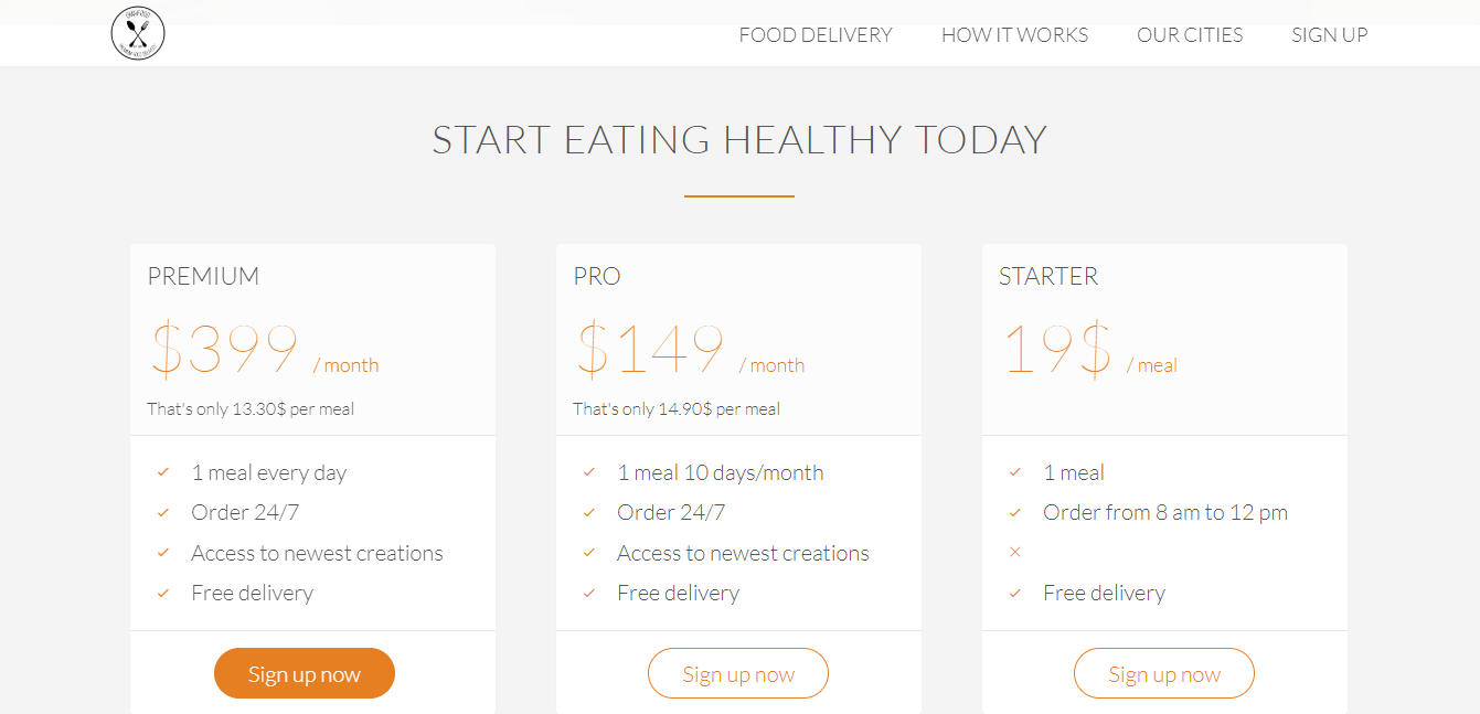
Omnifood is a service that provides Premium food delivery to help busy Professionals have more time & feel healthier by providing a mobile app where they can quickly order an affordable ,tasty, healthy lunch and have it delivered or pick it up .
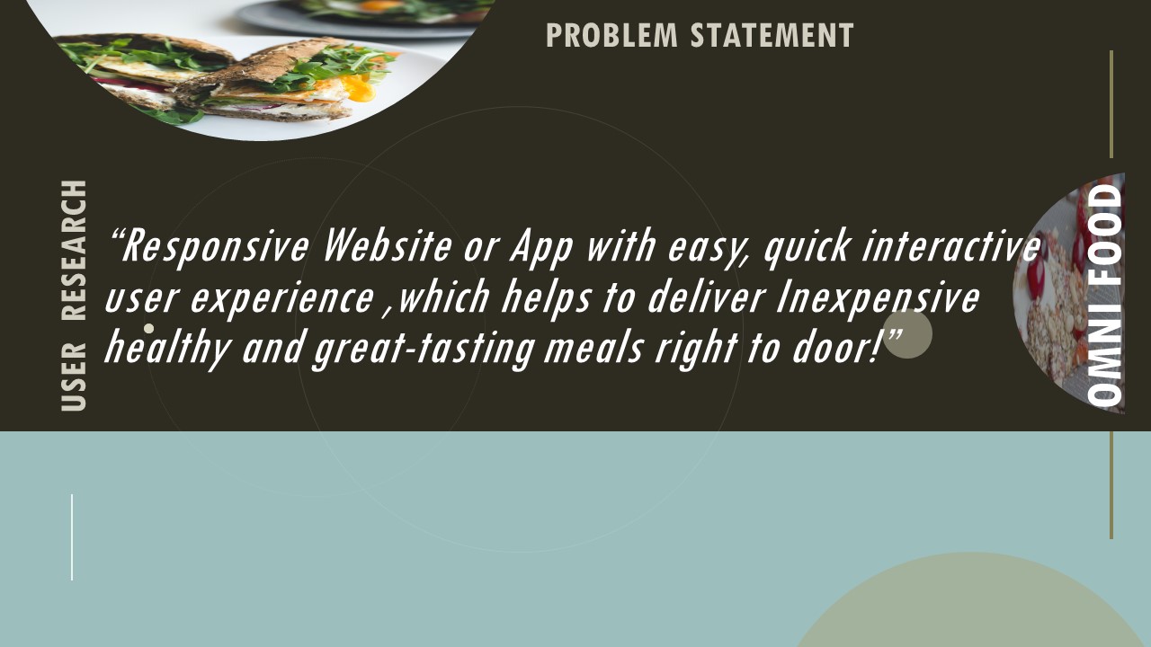
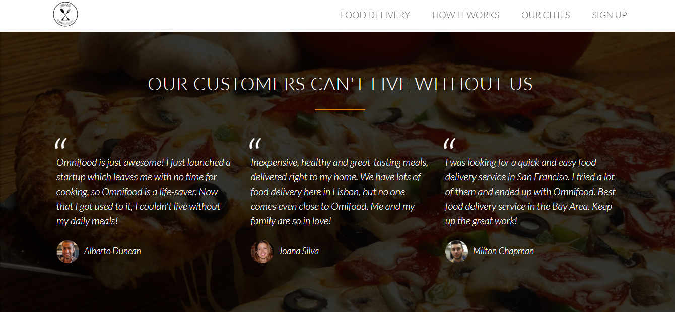
It solves the problem by providing a life saver service-inexpensive, healthy and great-tasting meals, delivered right to door.
My role was to create a visually impressive and friendly interactive app/website which would save time and efforts to order healthy online food.
PRESEnTATION


UX PROCESS
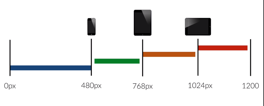
- Designed a Project,Responsive website and Mobile Application.
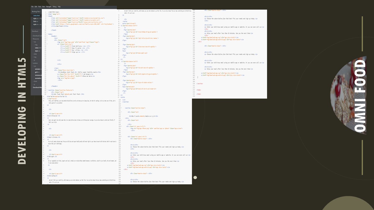
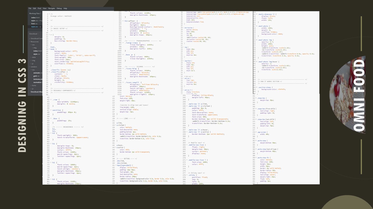
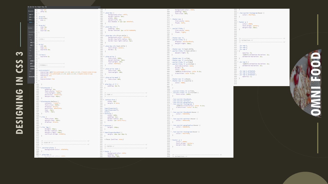
- Experience to develop the website on HTML5 AND CSS3
- Designing the E-Commerce Website
- Created and presented the concepts and user research
- Developed the Personas and the wire-frames
- Lo-fidelity to Hi-fidelity- Prototypes, Clickable Prototype
- Conducted, analysed in Google Analytics and synthesized the results of Usability Test by heuristic evolution
RESEARCH
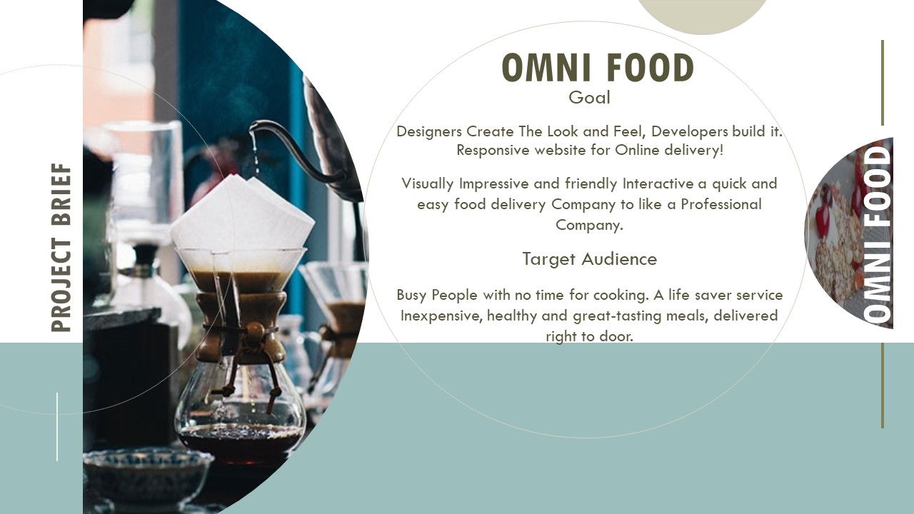
Goal
Designers Create The Look and Feel, Developers build it. Responsive website for Online delivery!
Visually Impressive and friendly Interactive a quick and easy food delivery Company to like a Professional Company.
Target Audience
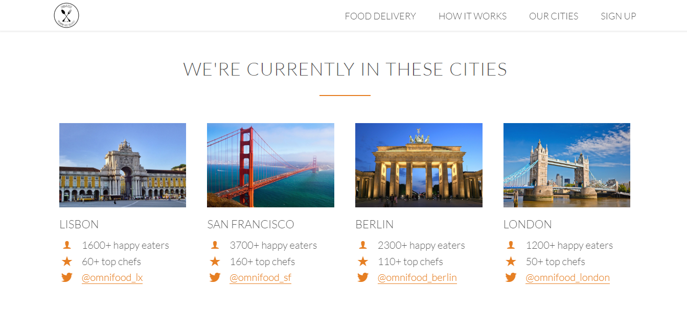
Busy People with no time for cooking. A life saver service Inexpensive, healthy and great-tasting meals, delivered right to door.
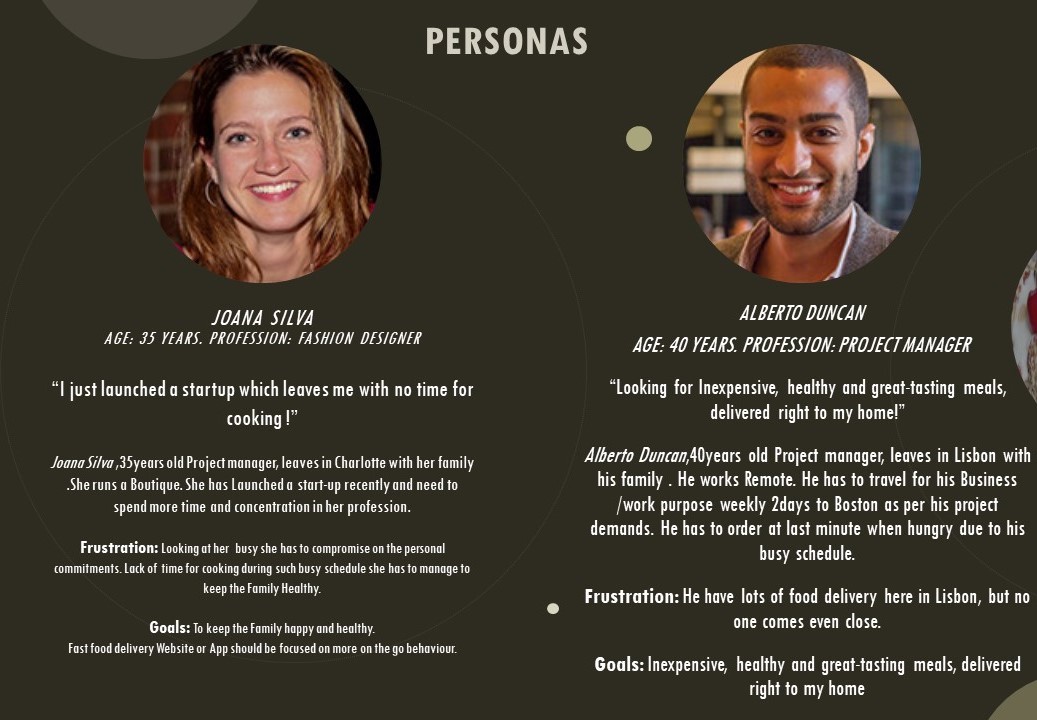
PERSONAS
Because design doesn’t exist in a vacuum, I decided to understand our product from the customer’s perspective through 2 user tests. I had users go through several tasks on UserTesting.com, and the way they struggled with the ordering the healthy food online was really eye-opening for me. There were simply too many steps in the process and sometimes they loose the interest due to busy schedule which charges on the health.
PROBLEM STATEMENT

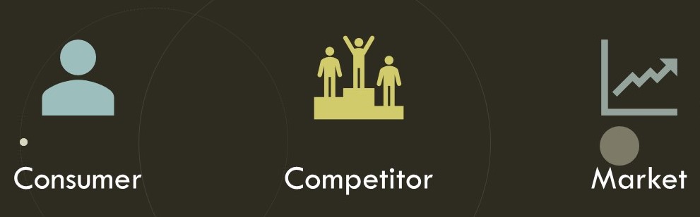
COMPETITIVE ANALYSIS
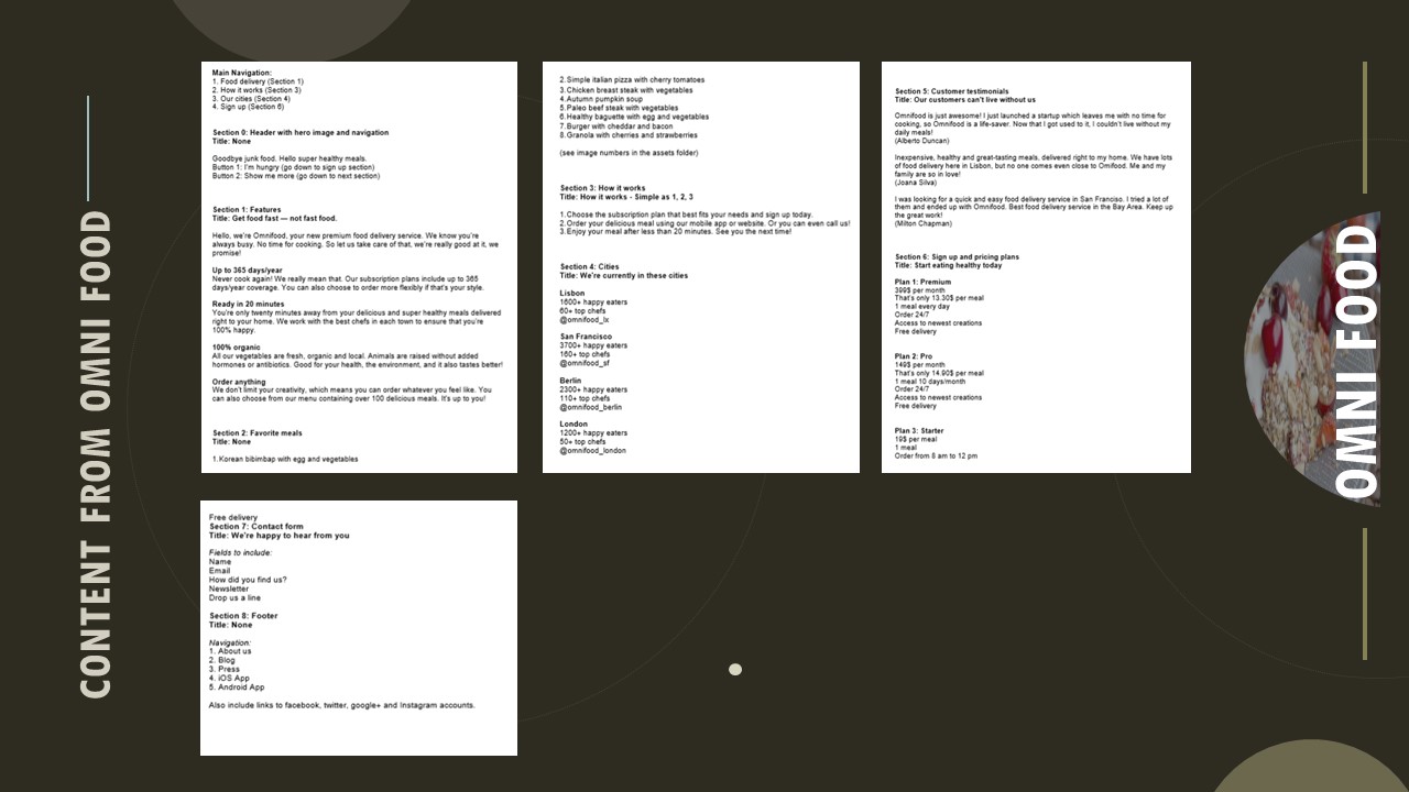
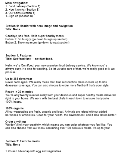
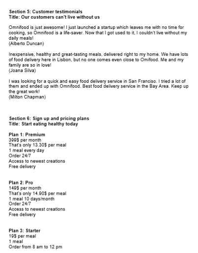
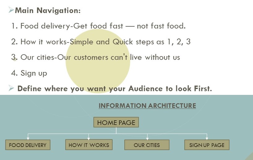
CONTENT OF THE WEBSITE

USERFLOW/NAVIGATIONS/ INFORMATiON ARCHITECTURE
STORYBOARD-LINE
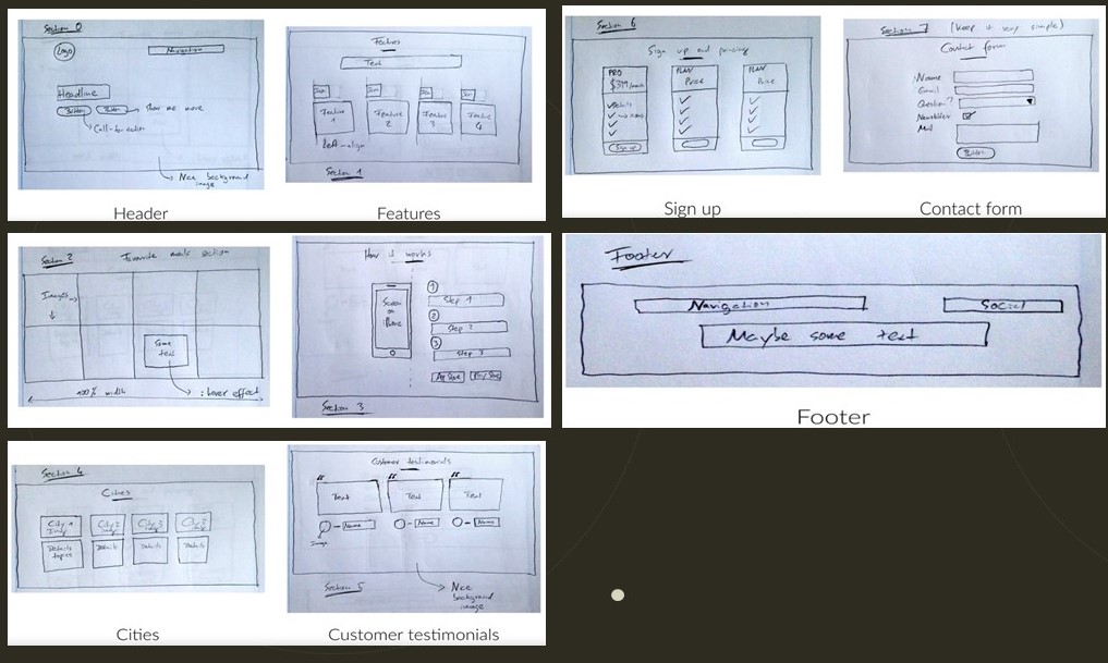
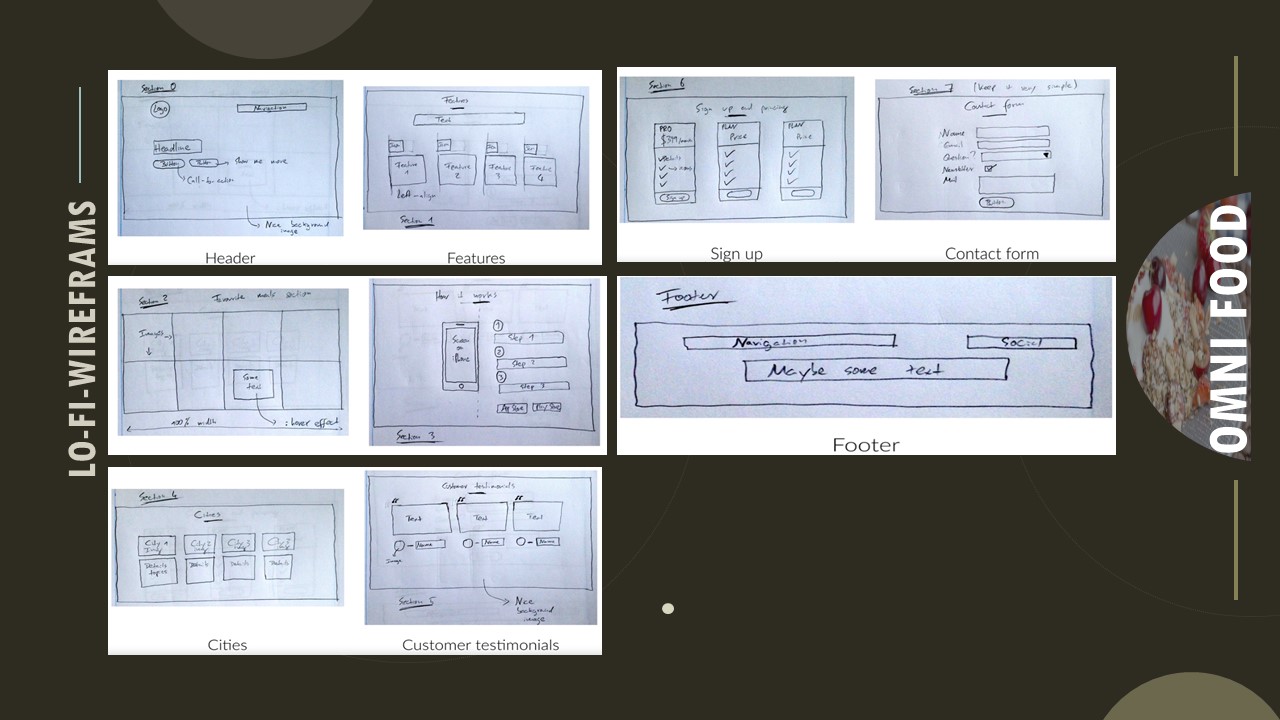
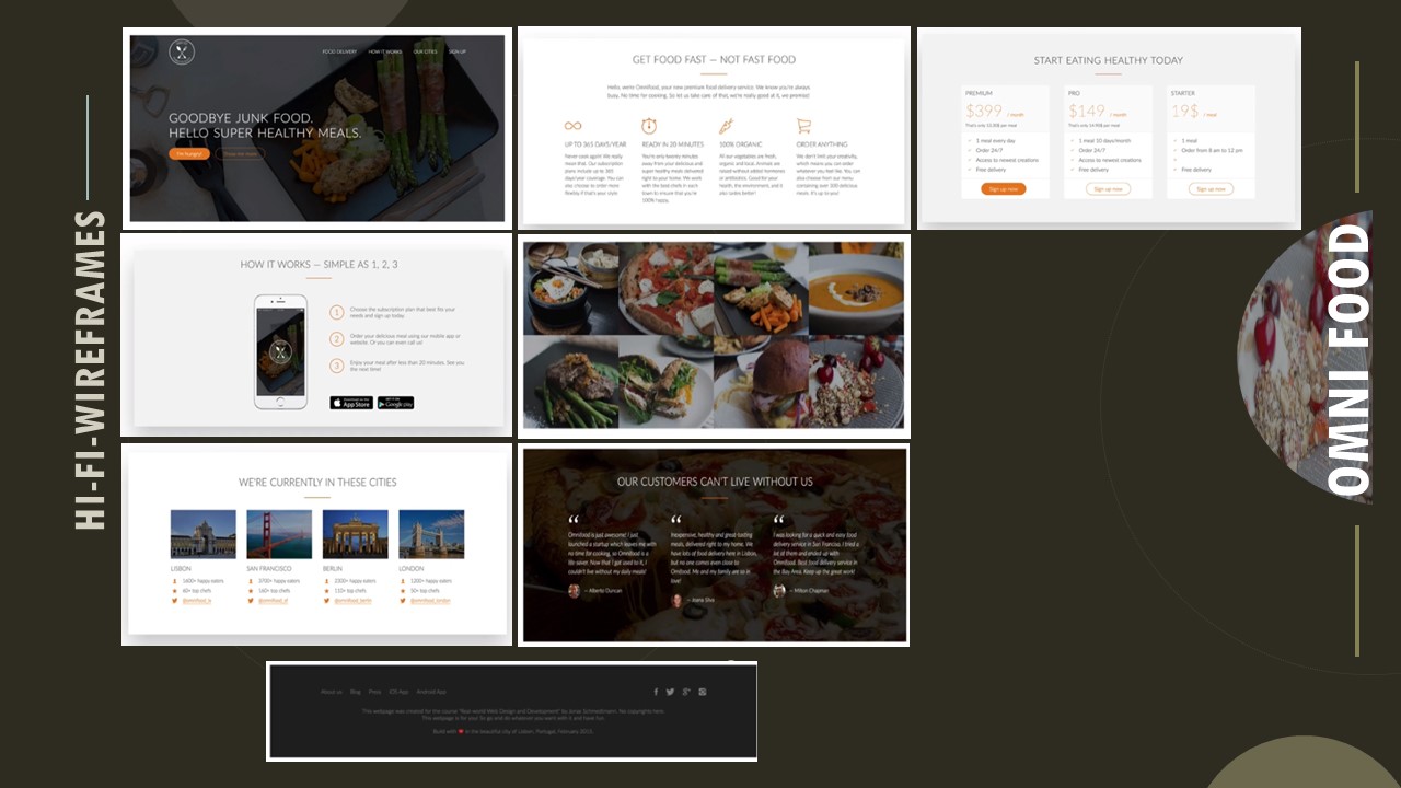
WIRE-FRAMING
After distilling the research, I created low-fidelity wire-frames using HTML5 and CSS3 to iterate through design options quickly. Working with the client, we used the wire-frames to discuss product strategy.
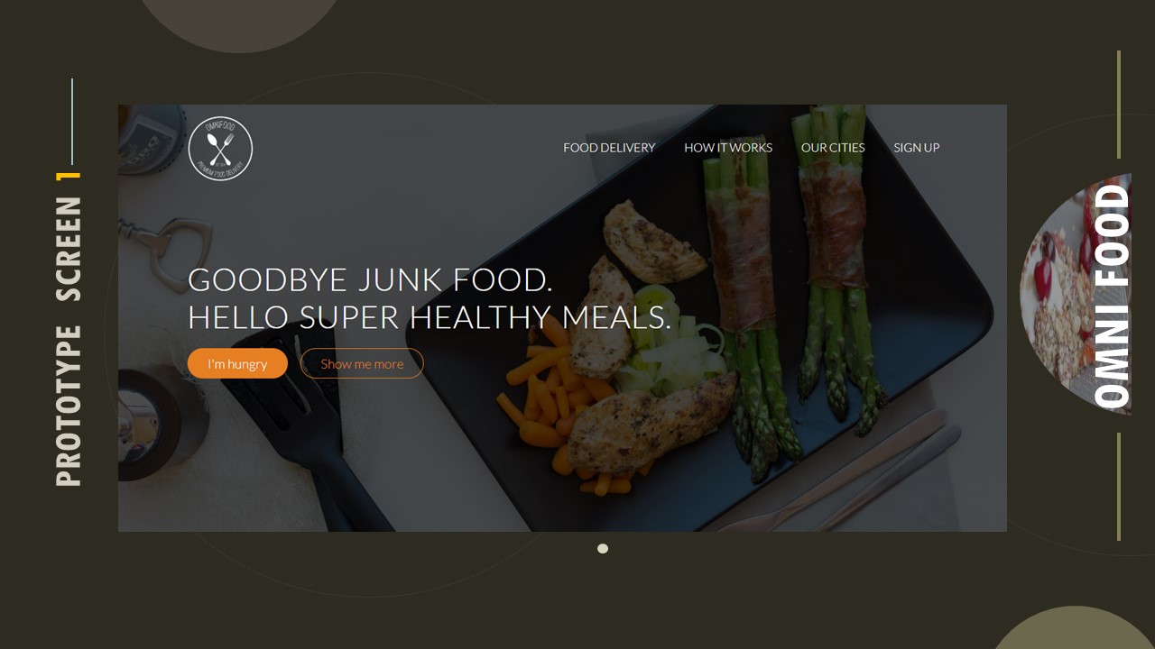
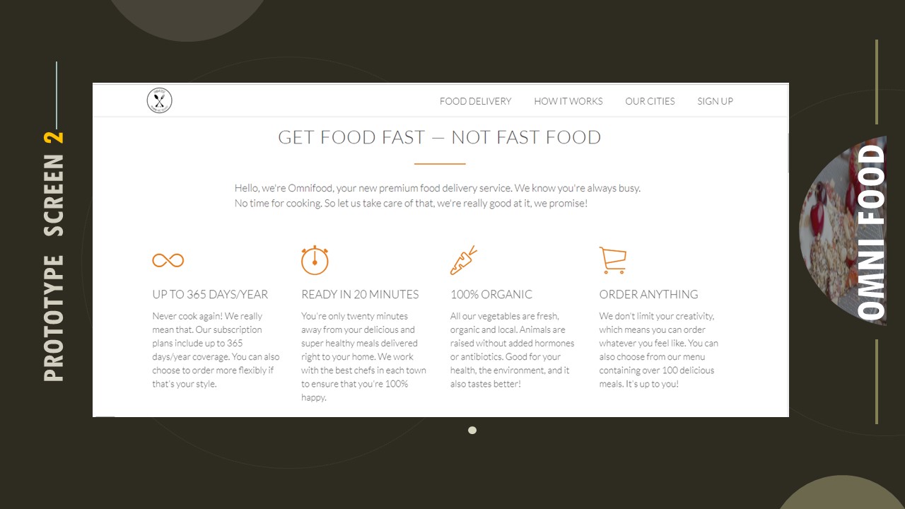
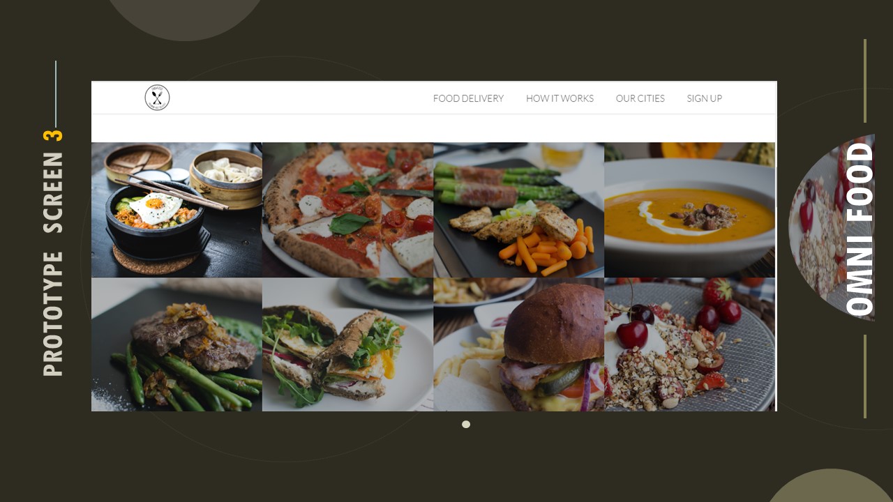
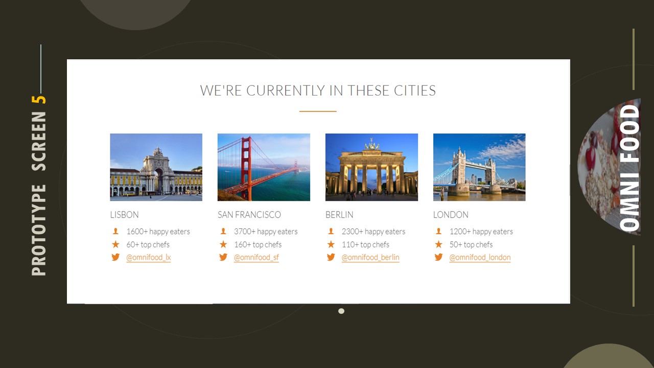
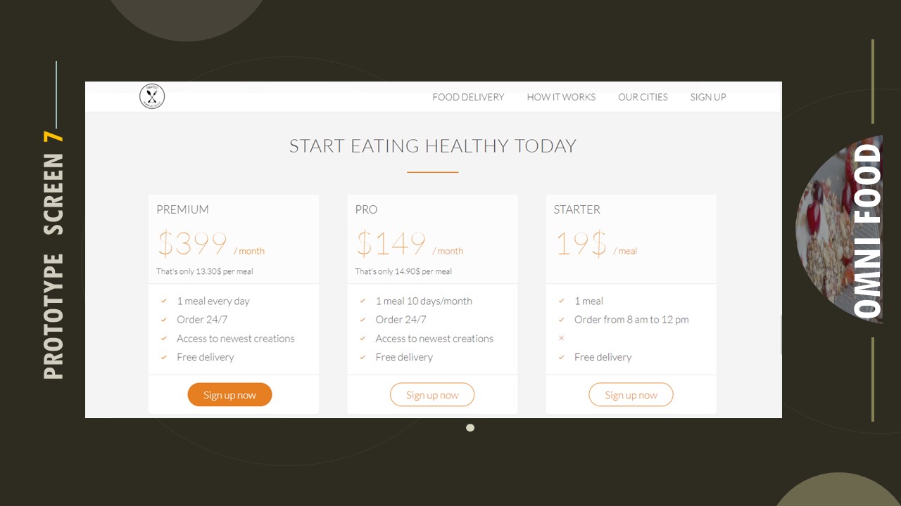
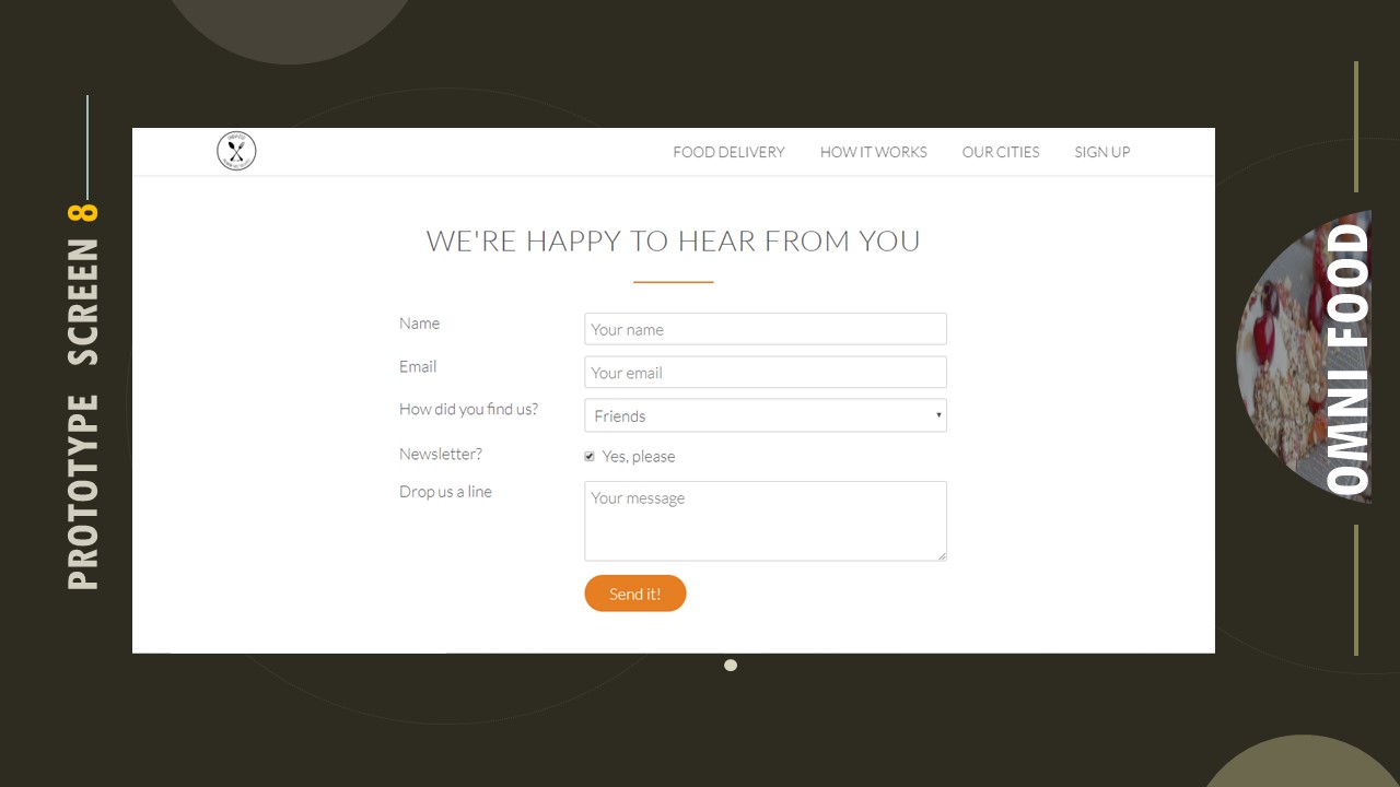
PROTOTYPING
Seeing is believing, and user flows finally “clicked” for the client after I had them play with my prototype. These medium-fidelity prototypes were also used in User Testing with 5 users to gauge between two of the major design options. The option using drop-downs and visuals won by a landslide.
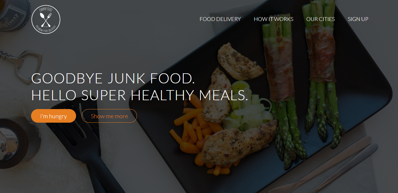
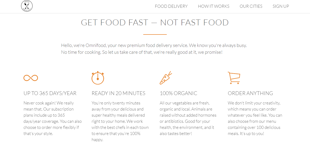


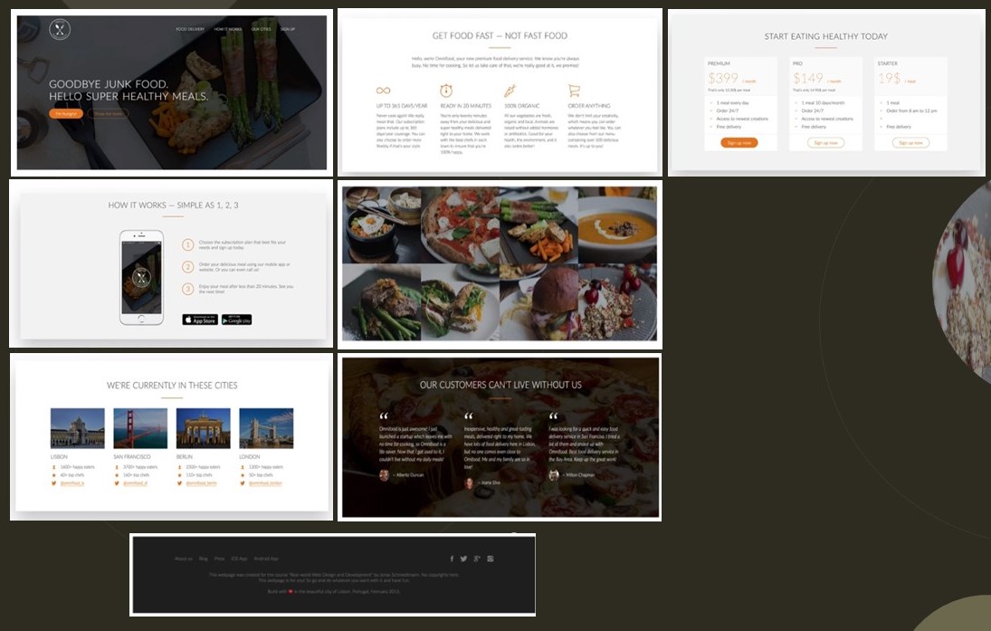
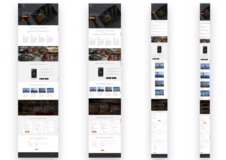
RESPONSIVE WEBSITE
SYNTHESIZING AND ANALIZING THE WEBSITE

LEARNING Recap
- I learned about the process of creating an website/ app and all the logistics that go into approval from the web development process. Mobile app development is both complex and fun!
- During the user research process, I was genuinely surprised to see how many users completely ignore the hamburger menu. It was not as obvious of an affordance as our team thought, so we converted to text-based icons. This tested to be much more effective with users.
- While the whole project was a huge learning experience, I especially loved iterating on designs and testing those new designs on users. This tight feedback loop helped take ambiguity out of our designs, and it felt good to produce designs with the confidence that users would enjoy and understand it.
 sheetalatuxdesigner.com